Dashboard
Dashboard Screen
After logging in to Brainspace and clicking a Dataset card in the Datasets display screen, the Analytics Dashboard will open.
The Analytics Dashboard includes the following features:
 |
Dropdown menus to open a different dataset, an existing focus, or an existing CMML classifier.
Links to open the Analytics (default view), Notebooks, and Supervised Learning pages or the User dropdown menu to access other user and system information. The Administration option in the User dropdown menu is only available for Group Admins and Super Admins.
Text field to search for concepts in a dataset, with icons at the right to manage search results, links for Advanced Search (which provides access to the Brain Explorer interactive visualization), Search History, and Saved Searches.
Links to open the Cluster Wheel, Communications, Conversations, or Thread Analysis data visualizations.
Documents "Candy Bar" graph displays the relative volume in the dataset of Original documents, Near-Duplicate documents, Exact-Duplicate documents, and documents Not Analyzed (for example encrypted or binary documents). Each type may be selected for inclusion as a search parameter.
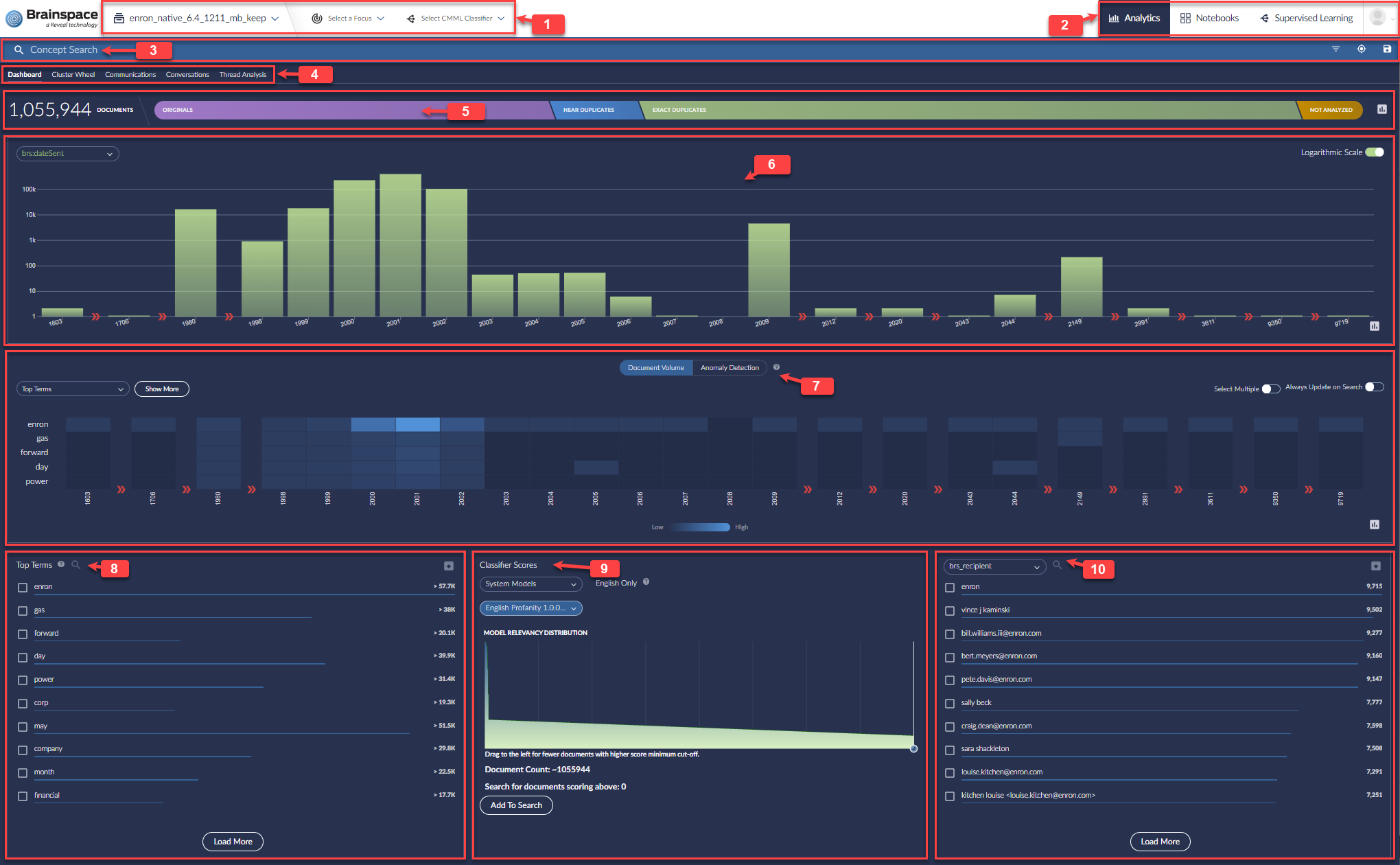
Timeline chart displays relative document volumes by year, month, day, hour, or minute in logarithmic scale (default) or linear scale. Timeline chart will display a chevron icon if no documents are present for two or more consecutive time periods. For example, the following image shows that no documents exist in the dataset for years 1981 through 1997, inclusive:
If no documents are present for only one time period (e.g., one year or one month), the Timeline chart will display a missing bar, not a chevron.
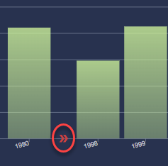
Heatmap displays a chart for term volumes by top terms over time and a chart for anomaly detection term volumes by terms over time. The Heatmap will display a chevron icon if no terms are present for two or more consecutive time periods. For example, the following image shows that no terms exist in the dataset for years 1981 through 1997, inclusive:
If no terms are present for only one time period (e.g., one year or one month), the Heatmap will display blank cells in the column, not a chevron.
Top Terms in the dataset shows document counts for the current search which may be selected as facets and added to the search. Load More adds additional concepts to the list.
Classifier Scores displays a graph showing scores for the selected System Model or custom User Classification. The graph's slider may be used to focus on higher-scored documents and add this selection to the search.
Facets presents a drop-down list choice of a metadata field or entity and then selection of values with current document counts to be added to a search.
Once a search is run, a Results panel with retrieved documents total, Relevancy Distribution graph and document cards will appear at the right.
Details on each of these elements follow below.
Document Bar
The Document Bar displays the total number of documents and a break-down of the total number of documents by original, near-duplicate, exact-duplicate, and not-analyzed documents. This can be the complete dataset if no filter is active or the result of any search or other filter.

Click the Document Bar to view only original, near-duplicate, exact-duplicate, or not-analyzed documents in the Analytics Dashboard.
Heatmaps
The Heatmap is disabled by default to increase the speed of search results in Analytics. The Heatmap includes two views—Document Volume and Anomaly Detection.
Document Volume Heatmap
The Document Volume Heatmap displays the co-occurrence of the top five terms over time.
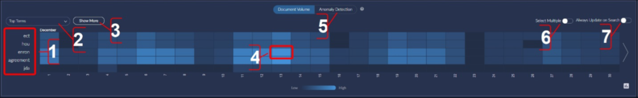
View the default top five terms in a search.
Create and manage custom top-terms terms lists.
Show more terms (up to ten).
View document volume for a node in the Heatmap or view the documents associated with a node in the Dashboard. Click on a node to execute a search for that term on that date interval.
Switch to the Anomaly Detection view.
Select multiple nodes to add multiple terms to a search.
Update the Heatmap automatically after a search. If not enabled, the Heatmap will automatically disable after each search to provide a more responsive update to the Dashboard.
Anomaly Detection Heatmap
The Anomaly Detection Heatmap displays the frequency of the terms over time. Anomaly detection uses a standard score to determine when a term’s frequency is higher than average. Brighter colors indicate higher-than-average usage.
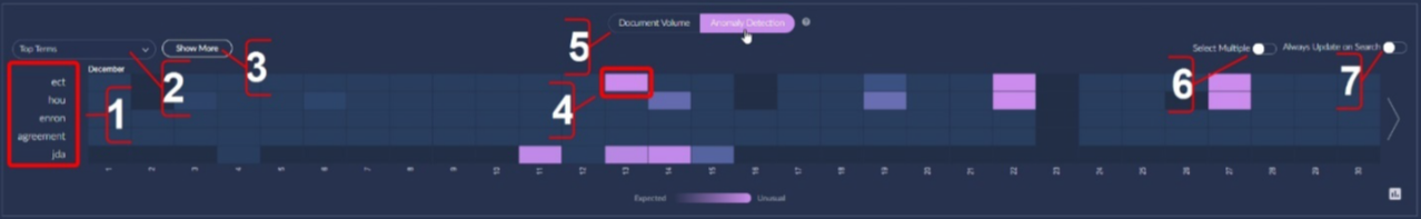
View the default top five terms in a search.
Create and manage custom top-terms terms lists.
Show more terms (up to ten).
View term frequency for a node in the Heatmap or view the documents associated with a node in the Dashboard. Click on a node to execute a search for that term on that date interval.
Switch to the Document Volume view.
Select multiple nodes to add multiple terms to a search.
Update the Heatmap automatically after a search.
Top Terms Pane
Top term values are document counts based on the frequency of their occurrence in de-duplicated documents with boilerplate and email headers removed. The Top Terms list is sorted by UsageScore, which is calculated using both the document count for the specific term and its weight. Clicking on a term will execute that term as a keyword search, which will reveal the actual number of documents containing that term.
Note
De-duplicated document counts can differ considerably from total document counts.
The Top Terms pane displays the top-ten terms by default:

Filter the list of terms.
Download a *.csv file of top terms, which includes the DocumentCount and the UsageScore for each term.
Rather than clicking on a term to run just that term as a search, tick the checkbox to add it as a Boolean OR search with other terms that have the checkbox ticked after clicking on Add to Search.
View minimum document counts for top terms. To see the actual counts, click on the term to run it as a keyword search.
Note
Minimum document count does not include duplicates or other excluded documents.
Add the next ten top terms to the Top Terms pane.
Classifier Scores
Brainspace 6.6 added a panel to the dashboard to select documents based upon either unsupervised or supervised machine learning and classification to be added to a search.
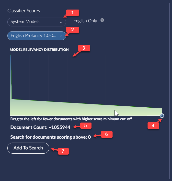
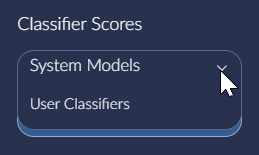
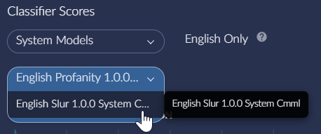
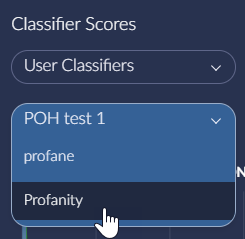
Select from the drop-down menu between Brainspace-supplied System Models and custom User Classifiers.
Once System Model or User Classifier is specified, select the desired Model or Classifier.
Note
Unlike System Models which are automatically run against the dataset, User Classifiers must be trained under Supervised Learning to a minimum threshold of at least one closed round. If a classifier has not yet been sufficiently trained, this message will appear:

The Model Relevancy Distribution graph will display the scoring for the selected model or classifier across the currently selected portion of the dataset.
The Relevancy Distribution slider narrows the model selection to those documents scored above a minimum.

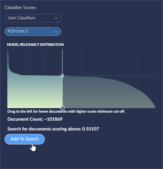
The Document Count will show the approximate number of documents responsive to the current search, which will be '~0' as the slider is moved and updated when it is set.
Search for documents scoring above shows the scoring at the current location of the Model Relevancy Distribution slider. When left all the way to the right, all documents are considered with a score above 0.
Add To Search puts a 'pill' for the Classifier Scores setting into the Search bar.
Faceted Data Pane
Brainspace provides two faceted metadata panes so that you can compare two different sets of metadata values side-by-side.
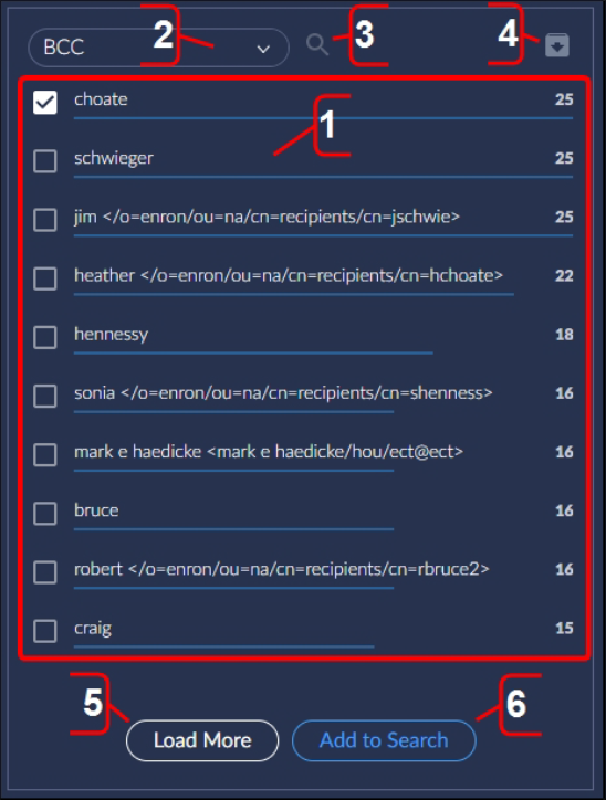
View the first ten metadata values for the selected metadata field. Click to run a faceted search for that metadata field and value. In the above example, clicking on “choate” will return every document that has a value of “choate” in the BCC field.
Select a different metadata field dropdown menu.
Filter the metadata values to look for a more specific value.
Export the selected metadata values to a *.csv file.
Add the next ten metadata values to the list.
Execute a faceted search or search for all selected metadata values.
Timeline Chart Overview
After opening a dataset in the Analytics Dashboard, the full Timeline chart for the dataset will display by default.
The Timeline chart includes the following features:
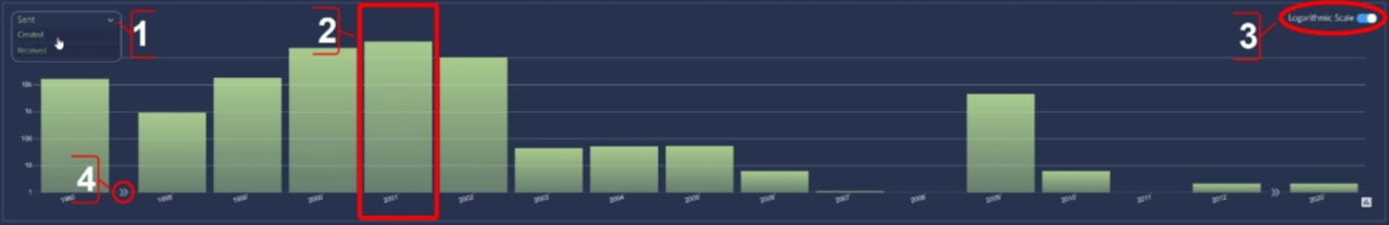
Dropdown menu provides options for viewing the Timeline chart for sent, created, or received documents.
Clickable bars for viewing the Timeline chart by year (default view), month, week, day, hour, or minute.
Switch the Timeline chart from logarithmic scale (default) to linear scale .
Identify missing documents in the dataset .
User Dropdown Menu
The User dropdown menu, accessible from every page in Brainspace, includes the following features:
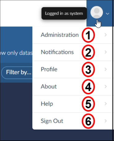
Navigate to the Administration screen to add new datasets, manage existing datasets, download system-wide dataset reports and individual dataset reports, manage users and groups, connectors, services, portable models, and troubleshoot errors.
View notifications from Brainspace.
Edit your personal information and manage your password.
View the Brainspace GUI and API versions, batch tools jars, and connector versions available for your Brainspace instance.
Log in to Brainspace Support Station online help.
Log out of Brainspace.
View the Document Volume Chart
After opening a dataset in the Analytics Dashboard, the Document Volume chart will be disabled and hidden from view by default.
To view the Document Volume chart, click the DISPLAY button:
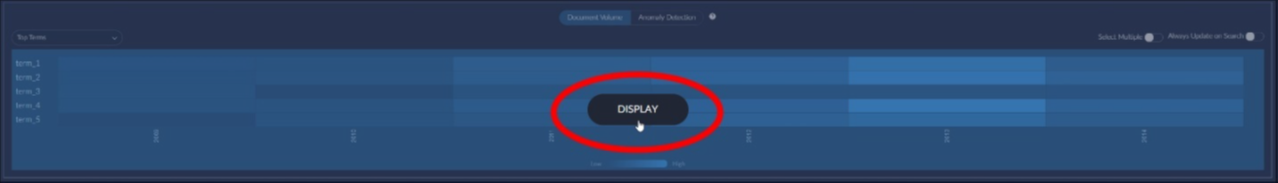
The Document Volume chart will display.
After creating a search to view a subset of documents in the dataset, the Heatmap will be disabled and hidden from view by default, and the DISPLAY button name will change to UPDATE.
To enable and display the Document Volume Heatmap automatically after a search, see Update the Heatmap Automatically on Search.
View Top Terms Document Volume Chart
After opening a dataset or creating a search, click the DISPLAY or UPDATE button, and then hover over a node in the Document Volume chart:
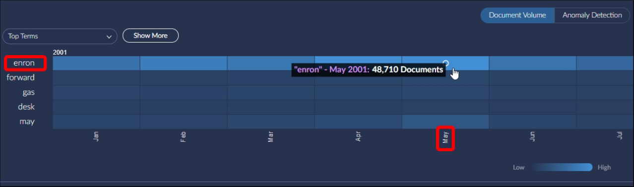
The document volume popup will display the top term, time period, and volume of documents associated with the node. Click to execute a search for that term in that time period.
View the Anomaly Detection Heatmap
After opening a dataset or creating a search, click the Display or Update button, and then click the Anomaly Detection button:
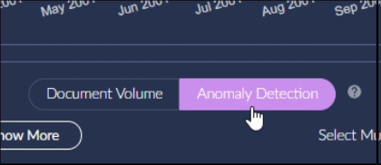
The Anomaly Detection Heatmap will display.
Add Multiple Terms to a Search
After opening a dataset in the Analytics Dashboard, the Document Volume chart displays will be disabled and hidden from view by default . After opening the Document Volume chart or the Anomaly Detection chart, you can add a single term or multiple terms to a search.
Note
This procedure applies to the Document Volume chart and Anomaly Detection chart.
To add multiple terms to search:
Click the Display or Update button.
Toggle the Select Multiple switch to the On position:
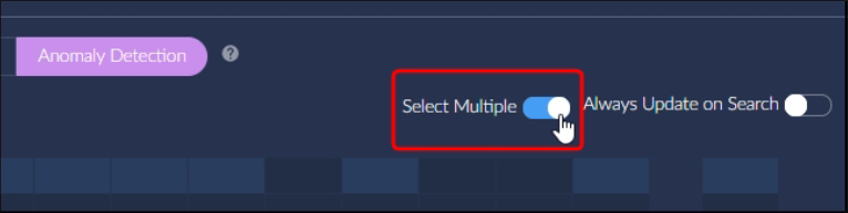
The Add to Search button will appear.
Click multiple nodes in the chart, and then click the Add to Search button.
The Analytics Dashboard will refresh to display the search results.
Click the Update button.
The added terms will display in the chart.
Update the Heatmap Automatically on Search
After opening a dataset in the Analytics Dashboard, the Document Volume chart will be disabled and hidden from view by default.
To enable and display the Document Volume Heatmap automatically after a search, click the Display or Update button, and then toggle the Always Update on Search switch to the On position:

The Heatmap will update and display automatically after every search.
View the Timeline Chart in Linear Scale
After opening a dataset in Analytics Dashboard, the full Timeline chart will display document volumes by year for the dataset or search results in logarithmic scale.
To view the Timeline chart in linear scale, toggle the Logarithmic Scale switch to the Off position:

View Documents Volumes by Year
By default, the full Timeline chart displays document volumes by the full span of time for the documents, usually at the year level, in a dataset or a subset of documents in search results.
To view the full Timeline chart, open the Analytics Dashboard.
The full Timeline chart will display by default. You can click a year bar in the Timeline chart to view document volumes by month for a specific year, or you can click-and-drag multiple year bars in the chart to view documents for multiple years.
View Documents Volumes by Month
To view the Timeline chart by month, open the Analytics Dashboard, and then click a year bar in the full Timeline chart.
The Timeline chart will refresh to display document volumes by month for the selected year. You can click a month bar in the Timeline chart to view document volumes by week for a specific month, or you can click-and-drag to select multiple month bars in the chart to view documents for multiple months.
View Documents Volumes by Week
To view the Timeline chart by week, open the Analytics Dashboard, click a year bar in the full Timeline chart, and then click a month bar.
The Timeline chart will refresh to display document volumes by week. You can click a week bar in the Timeline chart to view document volumes by day for a specific week, or you can click-and-drag to select multiple week bars in the chart to view documents for multiple weeks.
View Documents Volumes by Day
To view the Timeline chart by day, open the Analytics Dashboard, click a year bar in the full Timeline chart, click a month bar, and then click a week bar.
The Timeline chart will refresh to display document volumes by day. You can click a day bar in the Timeline chart to view document volumes by hour for a specific day, or you can click-and-drag to select multiple day bars in the chart to view documents for multiple days.
View Documents Volumes by Hour
To view the Timeline chart by hour, open the Analytics Dashboard, click a year bar in the full Timeline chart, click a month bar, click a week bar, and then click a day bar.
The Timeline chart will refresh to display document volumes by hour. You can click an hour bar in the Timeline chart to view document volumes by minute for a specific hour, or you can click-and-drag to select multiple hour bars in the chart to view documents for multiple hours.
View Documents Volumes by Minute
To view the Timeline chart by minute, open the Analytics Dashboard, click a year bar in the full Timeline chart, click a month bar, click a week bar, click a day bar, and then click an hour bar.
The Timeline chart will refresh to display document volumes by minute. You can click a minute bar in the Timeline chart to view documents for a specific minute, or you can click-and-drag to select multiple minute bars in the chart to view documents for multiple minutes.